Mailbox Providers
The following sections detail how to take advantage of Mailbox Providers feature within Mailtrap API/SMTP.
Why is it important to monitor mailbox provider stats?
It’s important because the deliverability towards a specific provider can suddenly drop. This is a clear sign that a provider has started treating you negatively, so it’s critical to take action to improve the situation.
Mailbox Providers filters
Mailbox Providers Overview panel allows you to filter by Domains, Mailbox Providers, and Categories. Here’s how to use each filter.
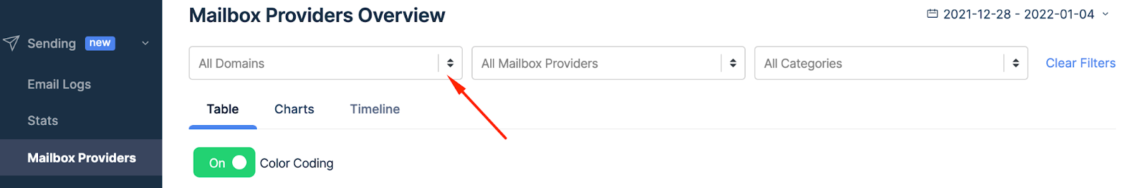
Domains
- Click on arrows in the All Domains box.
- Choose one or more domains you’d like to use.
- When you select the domain, the Table automatically shows corresponding statistics.
Mailbox providers filter
- Click the arrows in the Mailbox Provider box.
- Choose the provider you’d like to use.
- Check the corresponding stats in the table below.
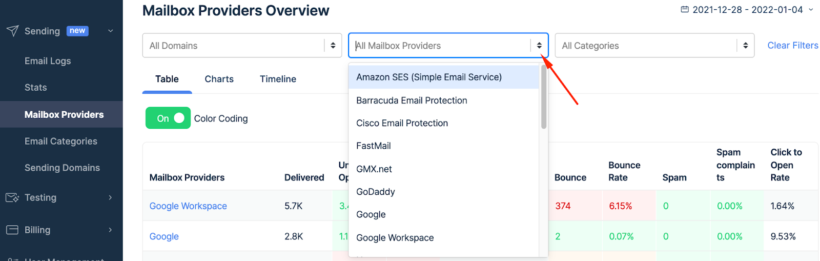
You can select a few providers at the same time - just repeat the actions listed above.

Categories
- Click the arrows in the Categories box.
- Choose a category or categories.
- Preview the stats for that category in the table below.

Navigating mailbox providers
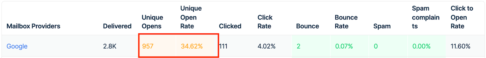
Table
The first column features Mailbox Providers of your recipients.
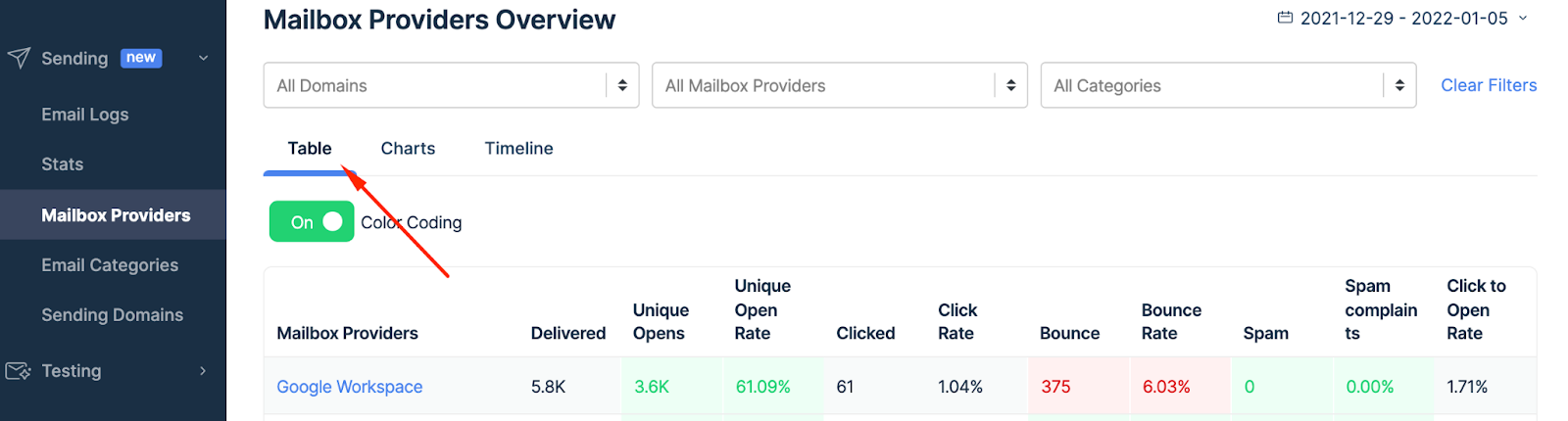
The stats include the number of Delivered emails. You can also see Unique Opens and Unique Open Rate, as well as Clicked emails and Click Rate.
Also, the Tables tab shows Bounce emails and Bounce Rate, plus Spam and Spam Complaints. Finally, you can see the Clicked to Open Rate.
You can learn more about Stats here.
Color coding
To immediately understand email deliverability, the table features colors that signal if the value is good, bad, or just average.
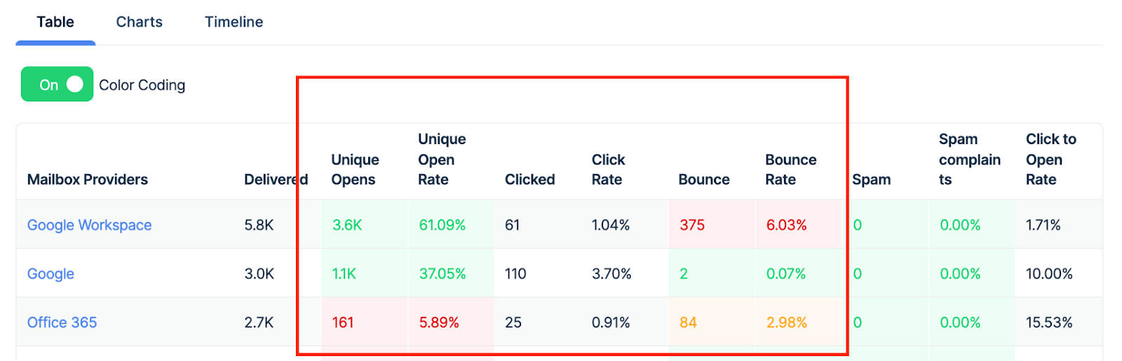
- Green - good results - exceed what we perceive as a satisfactory value for a particular data point.

- Yellow - borderline results - neither good nor bad, and may require your attention or action.
- Red - the result is under the threshold we consider satisfactory and it requires your action to improve the performance of a specific mailbox provider.
